My magazine
first draft
FRONT COVER
|
Contents Page
|
Article Pages
|
|
Front cover final Draft Contents Page final draft
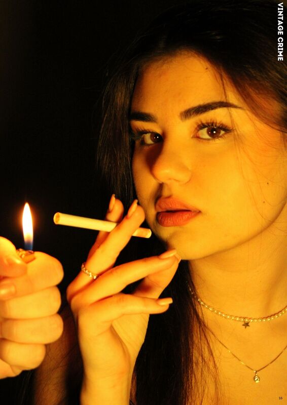
IN MY MAGAZINE, I CHANGED THE FRONT COVER BY ADDING MORE ANCHORAGE TEXT AND CHANGING THE FONT TO MAKE IT MORE INTERESTING TO SEE AND LOOK MORE LIKE A MAGAZINE. I also added more detail like the price, issue number and also a barcode. THIS WILL GIVE THE APPEARANCE OF A MAGAZINE RATHER THAN A POSTER, LIKE MY PREVIOUS DRAFT DID. |
|
I started my production process by choosing the most SUITABLE photos to add to the front cover, content pages and Article.
|
|
Front cover photoshoot
Three best choices for the front cover
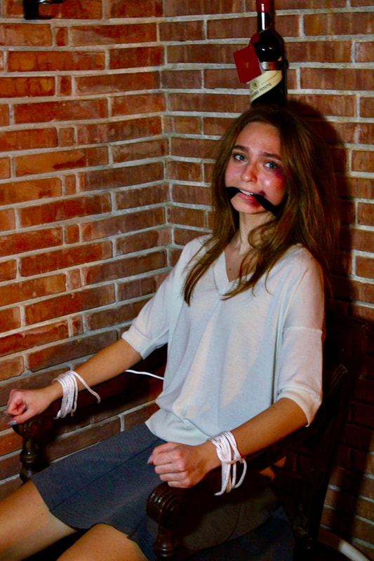
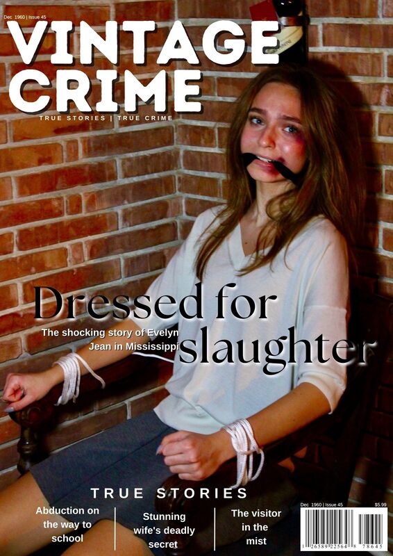
THIS ONE looked THE BEST due to the FACIAL EXPRESSION AS WELL AS THE BODY LANGUAGE, SHOWING SHE WAS ACTUALLY FRIGHTENED. |
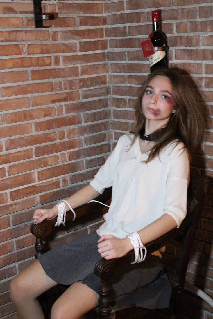
I really liked how you could see the bruises but she looks more relaxed |
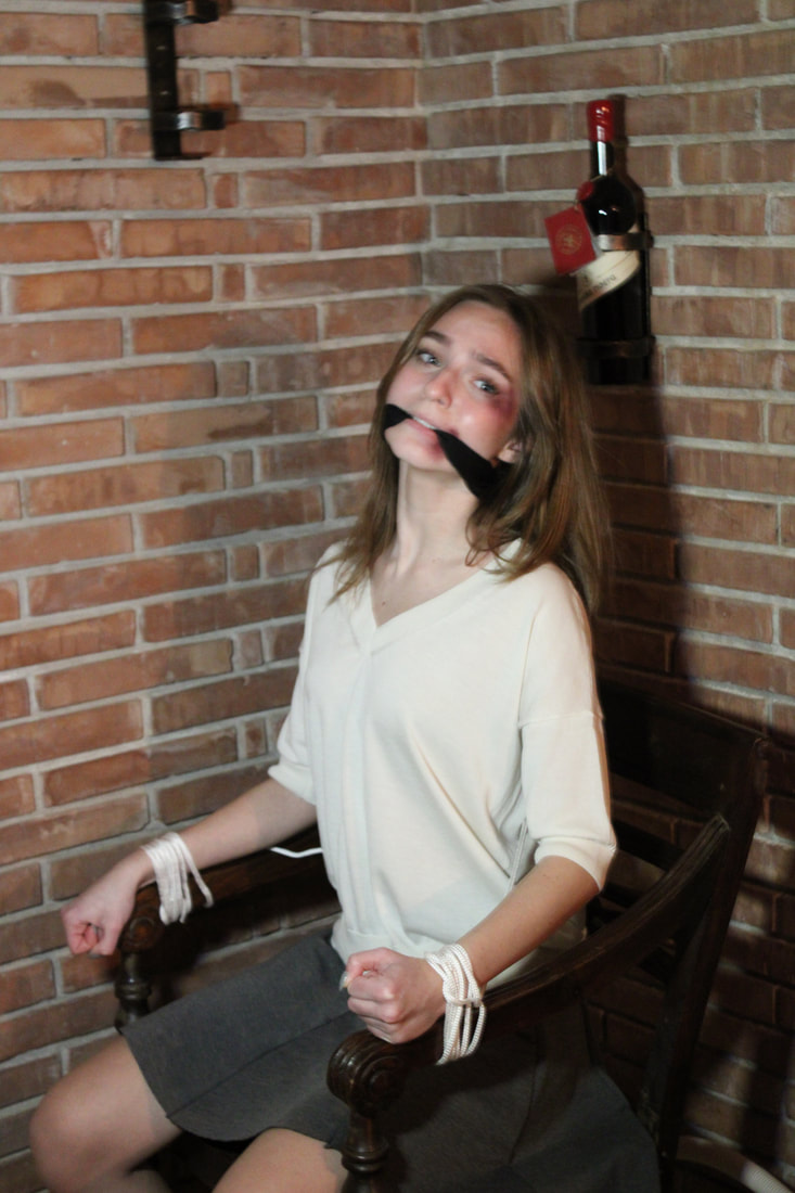
I liked the facial expression but the angle of the photo wasn't the best and also the POSITION of my model. |
Background
I used my celler for this photoshoot. As I was trying to achive a kidnapping scene through my photos.

|

|
Editing front cover

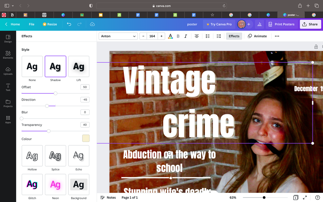
After I got my picture ready, I started working on the title.
|
I edited the picture using my macbook's editing app.
|
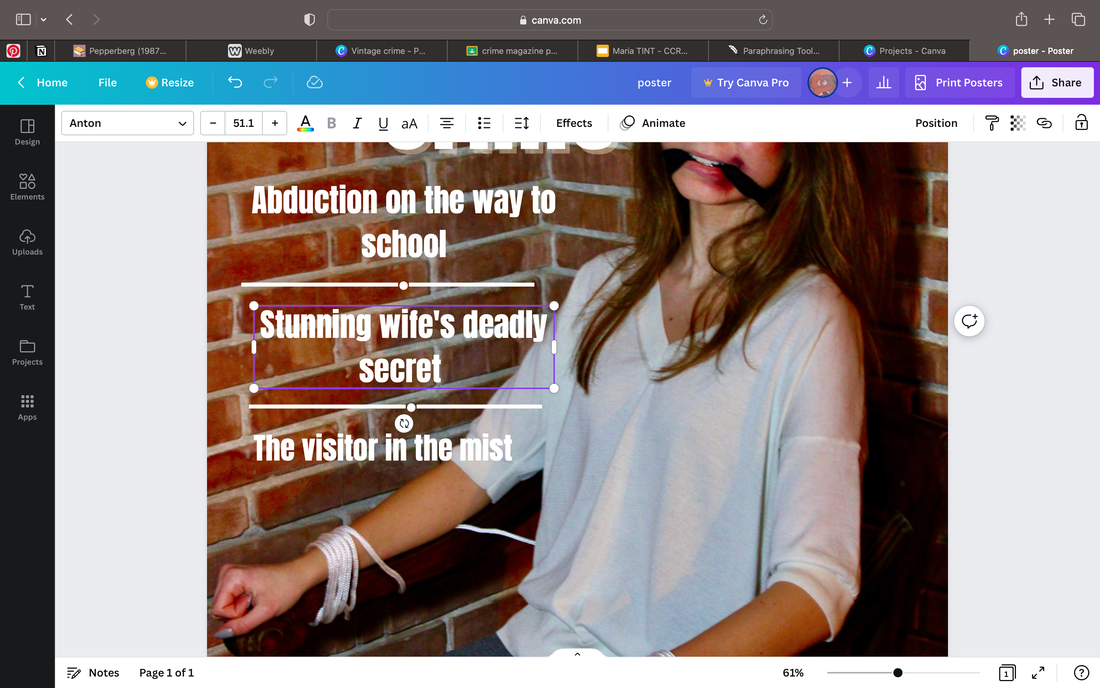
Content page photoshoot
Editing the content page
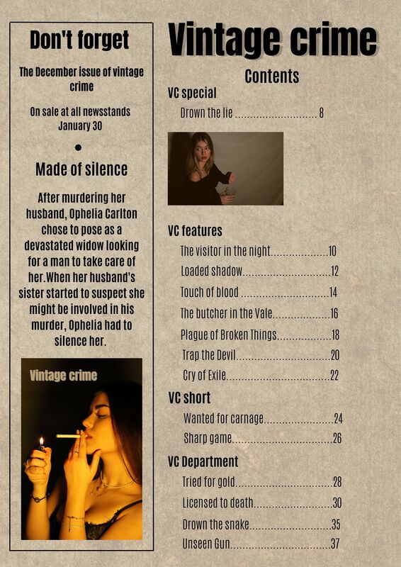
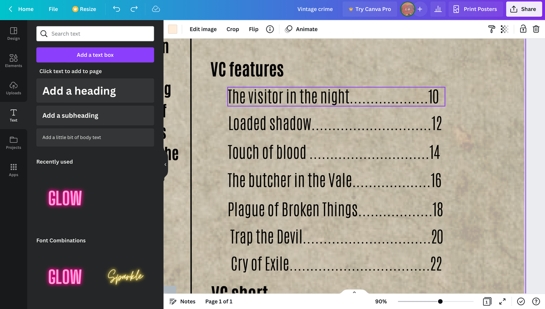
i CHOOSE A VINTAGE LOOKING BACKGROUND AND EDITED IT darker to give a paper effect. By doing this I made my magazine look more like the ones I was researching about. |

|

|
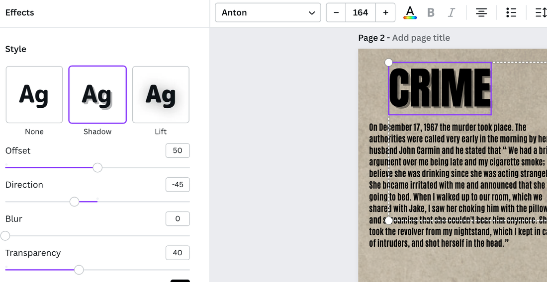
I also edited my magazines Masthead. i GAVE THE writing some shadow In the back to make it stand out more since there is a lot of writing THROUGHOUT my content page. I also used the Anton font as I did on my front cover as well.
|
I tried to make my magazine feel more like a book with chapters since by doing this it will create the illusion that my magazine is more antique. |
|
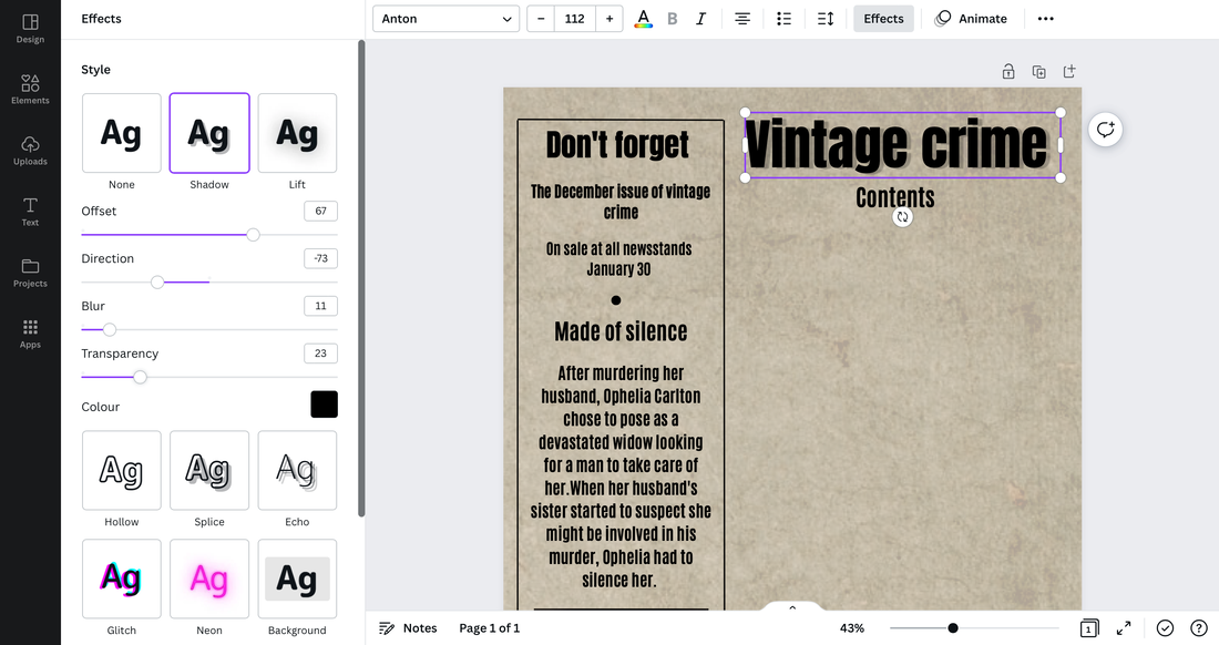
Article pages photoshoot
Editing the article
|
|
|
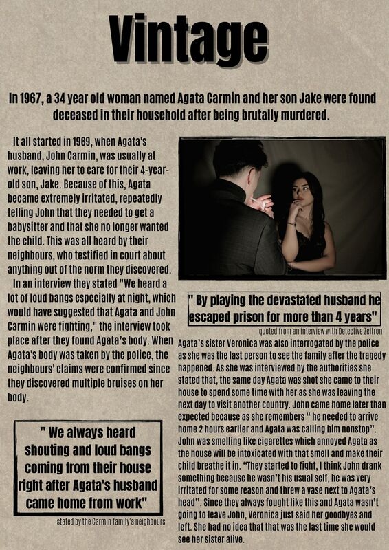
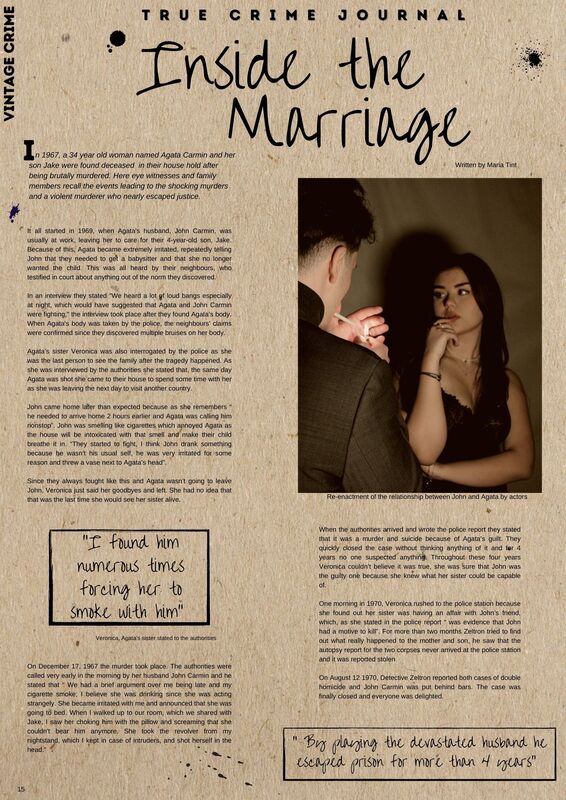
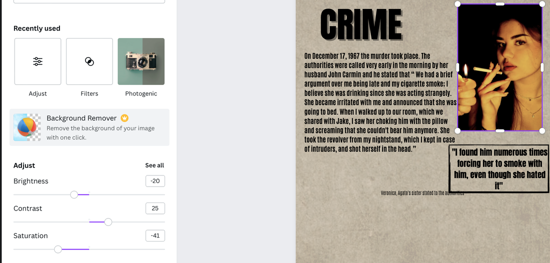
I edited to picture by making it more warm and less bright, this made the picture look less modern and also gave it the vintage look I was initially going for in my magazine. |

|
I edited this picture darker to give the look of an older murder article i was writing. By making it less bright it gives the reader the feeling of curiosity and MYSTERY as they don't really know exactly what the article is about and they are ready to find out. |
I used a black frame to put over the quotes I was writing, this made the article look more clean and also made the quotes stand out and be easily seen by the readers. Additionally I did this to show that they are another part of the article. |

|

|
I used an additional sentence right before writing my article. I did this to give some information about what the article is about but also to make people want to read more to find out what actually happened. |
I choose a SUITABLE font and a size for the writing in the article. I did this to make it look PROFESSIONAL and make the writing fit perfectly on the 2 pages. |

|
Background
I used a white background with very little warm light. This added some warmness on my models faces and made the pictures I took look more vintage. |

|
